Table of Contents
The purpose of a website is to reach new customers and keep existing ones engaged. Therefore, customer-centric approach should be at the top of your list of design features. After all, your customers are the key ingredient to the growth and success of your business!
Customer-centric website design has become a cliché in recent years. In short, it is easy to imagine what customer-centric design means. The needs of consumers come before everything else. However, the concept is not so simple in practice. Many nuances enter the equation.
What does it mean to have a customer-centric website? What are the necessary ingredients to reach the right users and keep them engaged with your business?
Adopting a quality user experience significantly helps customer loyalty. Nevertheless, in today’s era when high uncertainty is part of people’s daily life, the churn rate of dissatisfied customers is very high.
In a recent report, researchers found that approximately 88% of company leaders feel that customer engagement affects revenue. You can’t control every variable, but you can make sure your site has all the strengths for a customer-first web design that grabs them and keeps them on your page.
Here are some tips to create a customer-first approach. Maybe you already do some of these things, maybe not. Pick and choose what makes the most sense for your business model. Even small changes can have a big impact.
Know your customers
Before you can create a website focused on the needs of your customers, you need to know who they are. What are the demographics of your typical customers? Research them and find out what their needs and expectations are. How can you best help them?
You may also want to do some research on your website. What is missing that can help them? Is there anything they love? What do they hate? The more you know, the better your plan can meet their expectations. Create buyer personas based on their preferences.
At the same time, buyers sometimes say one thing but actually feel differently. No one is sure why people do this when asked. One way to deal with this issue is to do some A/B testing to see how they really feel about various changes. Are they responding as you thought they would? What other adjustments need to be made?
Use the Right Color Palette
Every business and industry tends to different shades. For example, businesses in the banking industry tend toward blue and occasionally red. Blue evokes confidence from users and has a calming effect. On the other hand, the fashion industry can use brighter shades, such as lime green. Think about what colors people in your industry expect, then find your color palette.
Each shade has its emotional impact. For example, red is a color of power and can evoke excitement in the viewer. Choose your shades accordingly to have the strongest emotional impact.
Accept Feedback
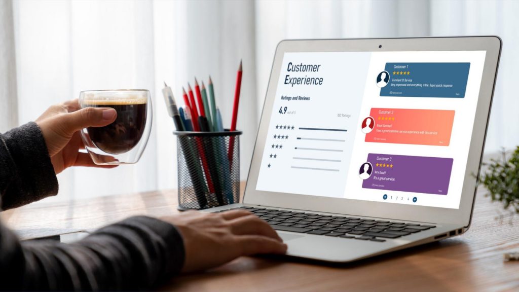
One of the best ways to improve your website over time to match the needs and preferences of your audience is to allow comments. Add reviews, put a feedback form in your footer, and even send feedback requests to your mailing list.
You can also enlist the help of a marketing professional. Ask them to look at your website and give you advice.
Be Responsive
Recent reports show that around 90% of people use mobile devices to connect to the internet every day. With phones becoming more capable and 5G bringing faster speeds to communities, expect users to use their mobile devices even more often to browse the internet.
Make sure your website displays properly on smaller screens. Be sure to try everything. Click on all the links. Fill out forms. Make sure images and text automatically adjust to the right size so people don’t have to scroll endlessly.
Keep Important Info At The Top
People are busy. They work, have families, and might visit your site on their 15-minute afternoon break. Most consumers want the information they need to make a decision and don’t want to deal with unnecessary stuff.
Place the main headlines and information they need at the top of the page so they see them first. Make it as easy to read as possible by using headings and subheadings. Add some dots. Also, people absorb information more easily in video form, so add a video that highlights the main benefits of your product or service.
Also consider that visitors to your website may have already visited and read some of the information. Some users come back just to sign up and want to find the spot quickly.
Create Multiple Landing Pages
As with most businesses, your products or services appeal to more than one category of potential buyers. Don’t just create a single landing page and expect it to fulfill every reader’s purpose. Instead, create unique pages for each audience you’re targeting to better meet their needs.
Make sure each landing page speaks the language of your specific audience. Consider the unique needs of each group. How do their needs differ? How can you best meet their specific needs?
Step Into Your Customers’ Shoes
Look at your website through the eyes of your audience. What should change? What works perfectly? You will gradually develop a web design that will appeal to those who are most likely to buy from you. Keep making changes and tweaking your website until it strikes the perfect balance for your customers.


